The Book and Bookalope
Or: What exactly does our structuring AI do?
This blog was made possible with the friendly support from W W Norton by providing all images. I also am very grateful to Keith Houston for writing The Book and for his kind feedback on this blog, and to Judy Abbate from Abbate Design for designing The Book so beautifully.
Some time ago I was able to enjoy a visit to London, which led me on a day trip to Oxford. Even on a rainy day, the town worked her charm as I strolled the streets and explored cafes, restaurants, and shops.
For a book-lover, a day spent in Oxford has to include the time-honoured University, and, in particular, the Bodleian Library. I often love to spend hours perusing old books and new editions alike, rummaging through shelves, and taking in the sheer amount of printed paper.
It was there, amongst those laden shelves, that I found The Book.
A book about books
To put it simply, The Book is a book about books themselves. It tells readers about the history of papermaking and typesetting, about illustrations and how to bring them to paper, about binding and the making of books. If I had to describe it in one word, I would use “fascinating.”
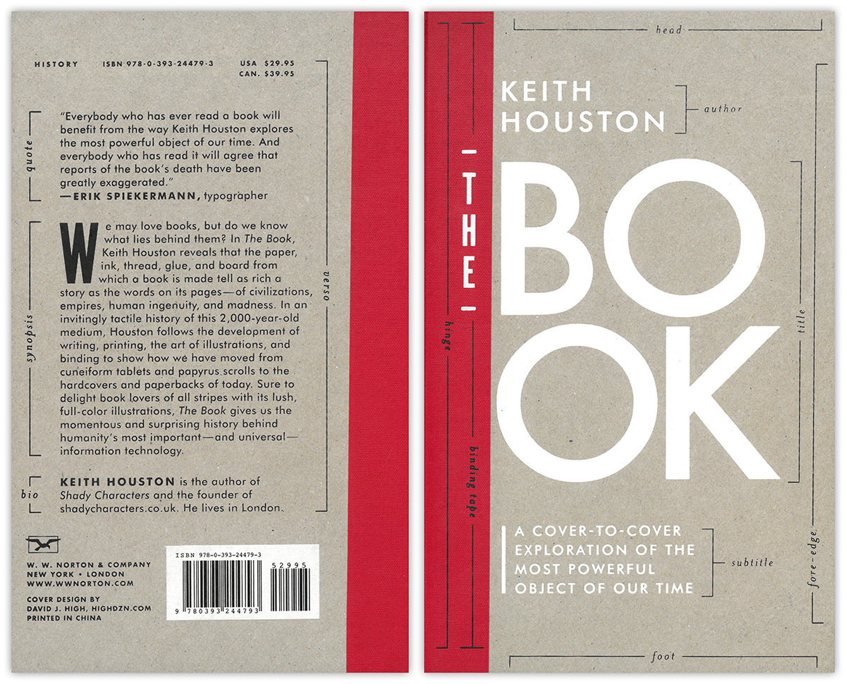
The Book first caught my attention because of its hardcover makeup, and the visually striking cover design:

Simple, rustic, with a heavy and sturdy feel in my hand, The Book is everything I’m looking for. The most intriguing aspect, however, are the labels for the different design elements on the book cover itself. There’s the “title” of the book, with the “author” name above and a “subtitle” just below; there are the “head” and “foot” of the cover as well as the “binding” and “hinge” on the left holding the book’s pages together.
Every visual cover design element has its label noted next to it!
Seeing labels assigned to the various design elements on the cover page is the perfect illustration of how Bookalope’s core tools work. More precisely, it demonstrates how Bookalope’s content classification AI works — it assigns to all elements of an uploaded book manuscript their respective meaningful label. In a sense, Bookalope’s AI makes the structure of the book — which we human readers intuit implicitly from the visual design — explicit.
There’s a sentiment amongst book designers that good book design is invisible. In his book, Aspects of Contemporary Book Design, Richard Hendel repeatedly illustrates how subtle, unintrusive design is important because it goes unnoticed. As a rule of thumb, if you don’t notice it, then it’s good book design! Good design supports and guides the reader, and is inviting her to explore and indulge in the content of the book rather than obstructing and distracting her connection to the text.
The Book is one of those well-designed books and, most exciting for me, its design happens to be quite similar to Bookalope’s own website design! Both Bookalope’s logo and the beginnings of sections in the book use large, red Baskerville capitals. The addition of this red text for emphasis is an age-old tradition called rubrication, taking its name from the Latin phrase meaning, “to colour red.” Rubrication can be traced as far back as Egypt during the age of the Pharaohs, where scribes would laboriously change to red ink when writing parts of the text that they wished to emphasise to the reader. Bookalope’s logo and user interface make use of this age-old literary tradition.
As the essays in Richard Hendel’s books attest, design is deeply connected to the content of the book — and it has been since the early days of literature. We might think of the content of a book as merely the text it contains, but in reality, the text is just one part of the book itself. Content has always been both structured and organized, and structure has traditionally always been expressed visually through the use of spacing, fonts, and colors — there’s no limit to our creativity! Understanding the structure of the text is a crucial aspect of the reader’s experience.
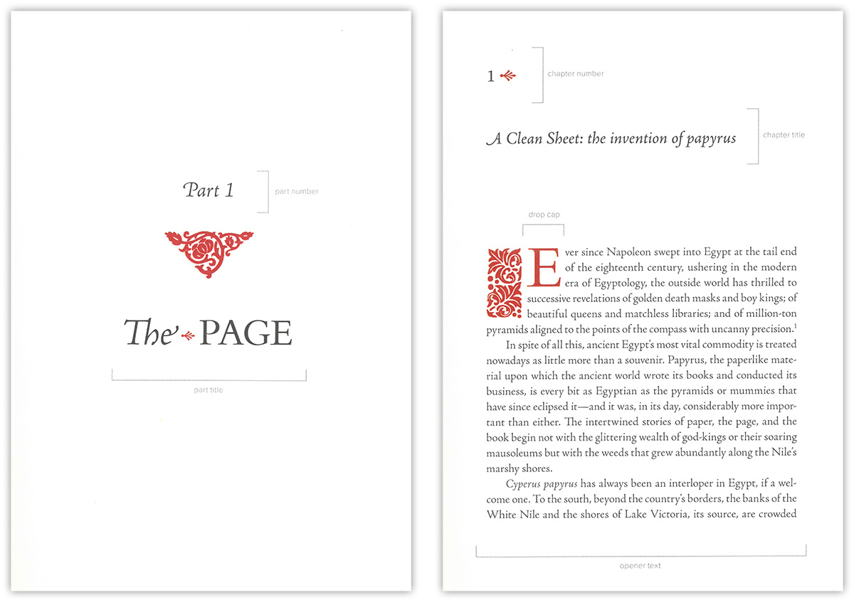
In its simplest form, a book’s structure consists of the headings and main text, which the book’s designer needs to visually express to the reader. For example, The Book’s opening pages and first chapter illustrate one way in which we can beautifully express the structure of the text content:

The opening of the first part of The Book contains a part number and a part title; the first chapter opens with a chapter number and chapter title. Following the chapter title begins the main text which beautifully opens with a rubricated “dropped capital letter”.
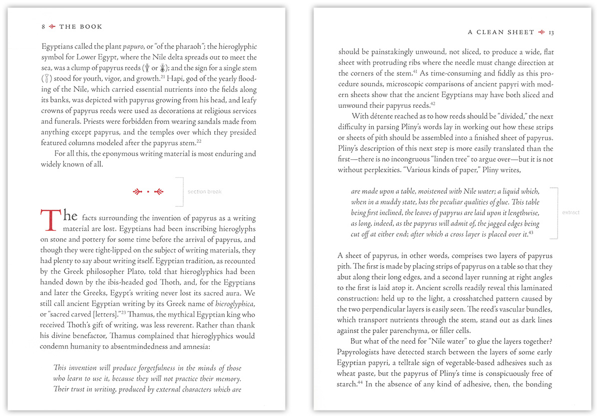
However, books are often structurally more complex than just headings and text. Nested headings, sub-titles, poems and quotations, images and tables and captions, footnotes, endnotes and so forth are just some of the facets that give a book its overall structure:

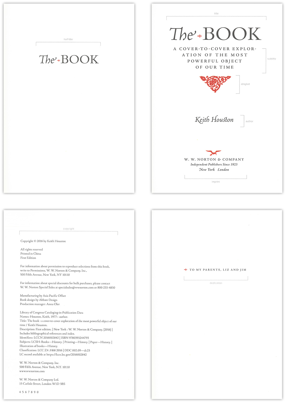
Then, there are the “matters” of a book — front, main, and back matter — where the pages themselves have a dedicated purpose and history, even their own unique design. Dust title and title pages, copyright, the table of contents, a dedication page. Often, references and indices are neatly organized at the end of the book.

As well as labeling each individual content element, we now also assign names — and therewith meaning — to the pages themselves that the content is printed upon.
The Book revisits the history and function of some of these dedicated special-purpose pages, which have survived countless changes over the centuries, and can still be found today at the beginning or end of a book. Like so many aspects of literature and design, a feature that initially arose from necessity has become permanently ingrained in today’s book structure and modern book design.
So, why do we structure content? Without structure, content is inherently untidy and difficult to access. Already the Egyptian scribes understood this and employed the use of rubrication to solve the problem. Today, we are still problem-solving text structure in a variety of ways and exactly this is the job of a book designer: laying out structured content on the page, and expressing the structure with various visual means such as text weight, font size, and the use of space.
But, until recently, all book design has been visual design, and that makes it difficult, if not impossible, for readers with visual (or other) impairments to enjoy books.
Bookalope: extracting structure from design
In a sense, Bookalope’s AI makes the structure of the book — which readers intuit from the visual design — explicit. Throughout history, book design has been overwhelmingly visual, but the rise of the web and the growing popularity of ebooks have shaken this approach — indeed the notion of the “book” itself — to its core. There’s no ignoring that book content is no longer limited to paper printing, but despite this, visual and print-centric design still dominate thinking and workflows in the publishing industry.
Structuring the manuscript of a book for both print and electronic publication is an involved process; it is time-consuming, but it often is also manual, tedious, and above all else, boring — things that we try our best to avoid in the age of automation. Publishers can spend many days transforming a single book manuscript into an electronic format, only for the final product to be poorly structured and, therefore, hardly if at all accessible.
The reality is that we need to structure content correctly if we want to build accessible ebooks that are equally enjoyable for impaired readers, if we want to optimize the reader experience, and if we want our books to have a clean, polished finish. And this is where Bookalope steps in.
Bookalope does exactly what The Book illustrates so beautifully: it attempts to “understand” the visual design of a manuscript, and it uses this understanding to assign labels to every single content element of the given manuscript. In a sense, Bookalope reverse-engineers the work that the book designer put in when she created those visual elements to express the book’s structure; its custom-built AI assigns labels to every content element. These labels help Bookalope to reason about and work with the actual structure of the book or manuscript. Most importantly, though, what would require many days of labour from an editing team can be completed by Bookalope to a high standard in just a tiny fraction of the time.
Why does it matter? In short: because we should care about our readers. Readers with a visual impairment, for example, browse and read books without being able to actually see the visual design, and therefore need to be able to navigate the structure of a book by different means. We need to build accessible books — and an important portion of making books accessible is making their structure explicit, beyond the visual design.
At its core, this is the most important aspect of all facets of book design: making the content of your book readable, navigable, and enjoyable to all readers. Which is why we built Bookalope: to give publishers an intelligent and efficient tool that helps to turn even coarsely designed books and manuscripts into clean, well-structured, electronic content. And that, in turn, allows publishers to efficiently produce accessible ebooks, well-designed print books, and InDesign files for professional visual book design, as well as other formats.